Game Interface Energy: Powering Design with Playful Progress Bars
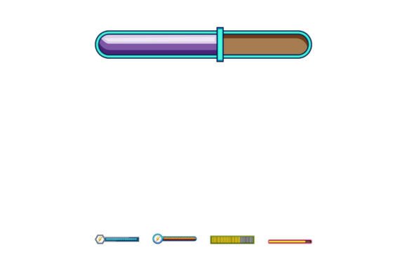
When it comes to digital design, few interface elements are as universally understood—or as visually versatile—as energy and progress bars. The Game Interface Energy and Progress Bars set brings a lively, cartoon-inspired aesthetic to these essential UI components, blending function with personality. Whether you're designing a mobile game, a branding package, or a social media graphic, these stylized bars offer a unique way to communicate progress, power, and performance while keeping your visuals engaging and on-brand.
Visual Personality and Style
At first glance, the Game Interface Energy and Progress Bars collection stands out for its bold, cartoonish charm. The bars are designed with exaggerated outlines, vibrant gradients, and playful textures that evoke a sense of motion and energy. Each bar can be styled to reflect different levels of completion or depletion, making them ideal for visual storytelling within interactive media.
These elements aren't just decorative—they're functional design assets that help guide user attention and reinforce game mechanics or app navigation. The cartoon style keeps the tone light and accessible, making them especially effective for casual games, kids' apps, or any project that benefits from a whimsical visual language.
Where Game Interface Energy and Progress Bars Shine
These progress indicators are not limited to gaming environments. Their stylized, scalable nature makes them adaptable to a wide range of creative and commercial projects:
- Mobile and Web Apps: Use them to indicate loading times, user achievements, or task completion.
- Branding and Marketing: Incorporate them into promotional banners or progress-driven campaigns, such as crowdfunding trackers or event countdowns.
- Editorial and Packaging Design: Add a dynamic visual layer to children's books, board game boxes, or collectible card sets.
- Social Media Graphics: Visualize progress toward goals, such as follower milestones or content series completion.
Because of their modular design, they can be easily customized to match brand colors, icon styles, and layout needs. This adaptability makes them a valuable part of any modern designer’s toolkit.
Design Impact and Audience Engagement
Well-designed progress indicators do more than just show status—they enhance the user experience. The Game Interface Energy and Progress Bars help establish a clear visual hierarchy by drawing attention to key actions or milestones. Their expressive style also contributes to a brand's personality, reinforcing a sense of fun, energy, or urgency depending on how they're styled.
From a readability standpoint, these bars use contrast, shape, and color effectively to ensure users can interpret progress at a glance. This is especially important in fast-paced environments like games or time-sensitive web interactions. When used consistently across a design system, they also help build brand recognition and design cohesion.
Choosing the Right Bar for Your Project
Not all progress bars are created equal. When selecting from the Game Interface Energy and Progress Bars collection, consider the following factors:
- Project Tone: Are you designing for a serious business app or a lighthearted game? Choose bar styles that match your project’s personality.
- Visual Hierarchy: Use color and size to ensure the bar stands out without overwhelming the layout.
- Customization Options: Look for sets that include editable vector files and multiple color variations for flexibility.
- Technical Compatibility: Make sure the files work with your design tools—whether it's Figma, Illustrator, or a game engine like Unity.
If you're using these bars in a commercial project, always verify the licensing terms. Most premium design assets come with a commercial use license, but it's wise to double-check for attribution requirements or usage limits.
Font Pairing and Integration
While Game Interface Energy and Progress Bars are primarily visual elements, their effectiveness is amplified when paired with the right typography. Since these bars often appear alongside text labels like percentages, titles, or instructions, selecting a complementary font is key to maintaining visual harmony.
For a cohesive look, pair them with a clean sans-serif font for readability, or a stylized script or display font if you're aiming for a more expressive interface. For example:
- Pair with a modern sans-serif like Montserrat or Poppins for a clean, tech-forward look.
- Combine with a bold script font for a whimsical or luxury feel, especially in packaging or editorial design.
- Use a retro pixel font for a throwback gaming aesthetic that complements the cartoon style of the bars.
Always test your font pairings in context. Readability should never be sacrificed for style, especially in UI environments where clarity is critical.
Real-World Applications and Design Tips
Here are a few practical examples of how to use Game Interface Energy and Progress Bars creatively:
- Game UI: Use different bar styles to represent health, stamina, or magic levels, each with its own color coding and animation cues.
- Interactive Infographics: Visualize data points like completion rates, user engagement, or progress through a learning module.
- Website Loaders: Replace standard loading spinners with a custom progress bar that reflects your brand’s tone and energy.
When integrating these elements into your designs, don't be afraid to experiment with layering, animation, and texture. The cartoon style lends itself well to dynamic effects like glowing edges, pulsing fills, or segmented animations that enhance the perception of movement and progress.
Final Thoughts
The Game Interface Energy and Progress Bars set is more than just a design trend—it's a practical solution for modern UI challenges. Whether you're building a mobile game, designing a branded app, or creating engaging web graphics, these playful, customizable progress indicators can elevate your interface while keeping users informed and engaged.
As with any design asset, the key is to use them thoughtfully. Match their style to your project’s tone, test them in real-world applications, and ensure they support—not distract from—the user experience. When used well, these cartoon-style bars can become a signature element of your design language, helping your project stand out in a crowded digital landscape.